


On the 13th of June 2015, my wife and I had our lovely wedding.
We did most of the planning together, her on the copy text and me on the visual execution.
We wanted an identity that was simple, clean & bright, traditional yet modern, and to have a party to remember.
Our target audience were our family, close friends & of course ourselves!
Weddings can be really confusing for guests, so we aimed for a visual and written communication that was clear.


Nature & flowers, gold, classic styles & a memorable party!


The monogram is based on the first letters in our names: Janne + Jørgen.
We wanted the monogram to be recognizable when transferred too. An important feature was therefore that it should be easy to draw and thus replicate on bottles, invitations and the likes.


We chose gold as our main color. That’s an obvious choice for a wedding. The message we wanted to convey were tradition and warmth. For the flower arrangements we interpreted the gold to be yellow. Spraypainting flowers or adding gold-colored adornments to the flowers were never an option, as we felt it would collide with our wish for nature to really stand out with wild picked, Norwegian flowers.
As a secondary color we chose nature green, retrieved from the Bergen mountains lush green shade in the spring and summer season from all the rainy weather.
The color for the typography were a set in soft grey, making the darker parts still light.
By having paper and white as a core color it was easier to keep the print on a low budget.
I found a nice 200g paper with yellow tint from Fabriano, which added to our wish for a look that used nature’s colors.

For typography we went for two different styles.
To convey a feeling of tradition we went with the classic Caslon typeset, first created in 1734. A font with a long history without being a cliché. It has lovely oldstyle figures, nice ligatures, thick strokes without being chunky and is really simple in use.
As a contrast we went with the sans serif Whitney from Hoefler and CO. It's a simple yet elegant font with humanistic features and represent modernity.


For a pattern, nature were the main reference based on four common tree leaves in Norway; birch, oak, ash and rowan. Mistletoe were also used, as a symbol of love.
Sadly we couldn't use real tree branches as decor due to allergic relatives, but they were still with us on the prints we made.
Other elements were party related. As decor we had light bulbs, pennants in white and green & huge golden balls. The same elements were used in some of the print to set people in the mood and rise the expectations.
To differentiate the print collection we added a border based on circles, making it easy to separate the prints at glance.


3D render : JHåland
As a “Hold the date!” note we kept things simple by sending it digital by e-mail, thus saving a lot of money on stamps.


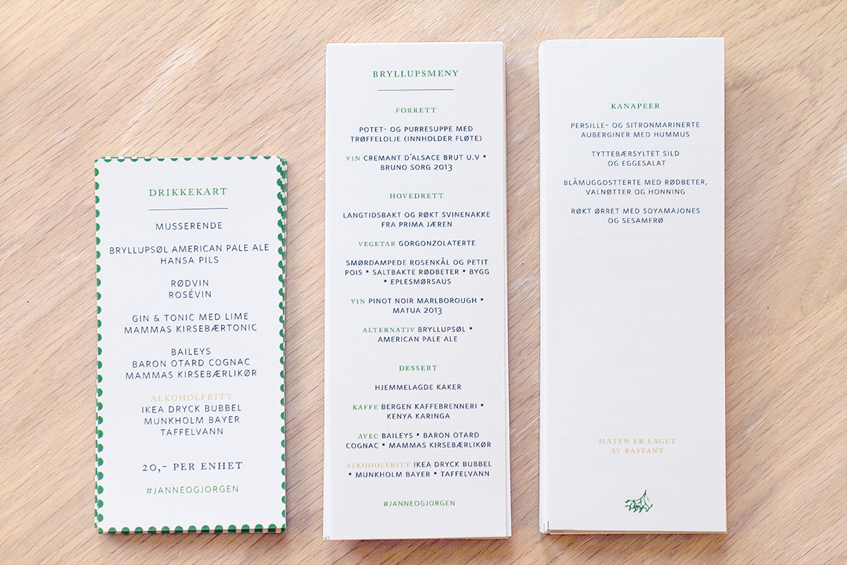

Photo: 01 JHåland 02 JHåland 03 Ørjan Andreassen 04 Henrik Lande 05 Henrik Lande 06 Henrik Land 07 JHåland 08 JHåland 09 JHåland 10 JHåland
We needed invitations, drink maps, dinner menus, a ceremony plan,
different small prints & a thank you-letter.
I also made a day plan & drink menu out of two chalkboard frames to complement the prints.
These were hand drawn with chalk & set at strategic places at the venue.


Photo: JHåland
Thanks to my mum and a friend of her, all the flowers were done just right.
Simple, natural, golden yellow, white, with wild straws & lots of green.
Clear glass was an important feature to us - again because it felt more in line with nature. So for vases old jam jars were used.


Photo: Marianne Bjørgan


Our friend Morten Isaksen made homemade American Pale Ale for the party. The label was hung at the bottleneck, and the monogram were stenciled on with paint. And of course the bottles had golden caps! They were so popular many brought the bottles home with them as a souvenir.


For the groom speech I created a animated backdrop that would follow my words.
The idea behind it was: me and my wife-to-be have lived together for six years and shares many memories and stories. But we’re also writing a new history together and weddings are sort of a new beginning. A book is a great symbol for this, as it can hold both the past and the future in its cover.
The opening of a book in the video was inspired by Disney and how they have used the book as an intro in their early animated films. The cover style came from Coralie Bickford-Smith Penguin book series, such as Sense and Sensibility.
My wife is obsessed with books, love Disney and have read all the Jane Austin novels. So this was also a cunning plan to tailor the speech to her taste and interests :)
I also had plans two other covers that represented both our families history. In the video they were supposed to be placed in the background. But time went by, and the idea ended in the sketch phase.
This is a shorter version of the video. The more personal stuff has been removed, but you can still get a pretty good picture of how it turned out.


